The updated OPAC uses Bootstrap - an open-source CSS framework - to organise zones, tabs and containers to present a variety of content. Spydus offers its users the ability to customise some Bootstrap elements from the Maintenance front end. This allows users to quite specifically define the amount of space that zones (defined spaces within a display area) and containers (content that sits within a zone) occupy on various screen sizes.
The definitions cause content to responsively fill space, or collapse to conserve space, based on the screen size. What this means for the end user is that OPAC content will always be presented in a way that is appropriate for the device that they are viewing it on, from phones, to tablets, to high resolution monitors.
This page will cover an introduction to Zones and Tabs. For information on building Containers, see the Container properties article.
Zones
The OPAC is divided into a number of Zones that use column (col) Class definitions in the Zone properties section to control how much horizontal space they occupy in the page.
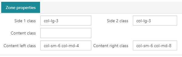
A zone's col Class definitions can be used to define them generally, or as shown in the screenshot above, to define them specifically on different screen resolutions.
Each class scales upwards, so if the class for a larger screen size is not defined, Bootstrap will look to a smaller class.
The col classes are:
| col | extra small devices - screen width less than 576px |
| col-sm | small devices - screen width equal to or greater than 576px |
| col-md | medium devices - screen width equal to or greater than 768px |
| col-lg | large devices - screen width equal to or greater than 992px |
| col-xl | xlarge devices - screen width equal to or greater than 1200px |
The below image is an approximate illustration of the default layout of the OPAC, and the available Zones available using the Container Parameters interface.
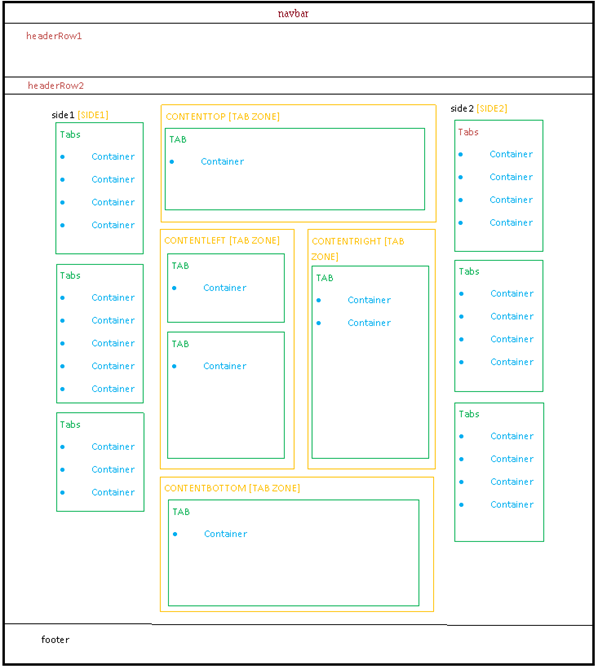
The available zones as illustrated are:
- SIDE1
- CONTENTTOP
- CONTENTLEFT
- CONTENTRIGHT
- CONTENTBOTTOM
- SIDE2
The body itself - the area between headerRow2 and the footer - is divided into 12 columns, and each zone can do one of two things:
- take up a defined amount of space
- have its column width undefined, and take up the remaining space to its right
In the illustration above, the zones are approximately configured as such:
| SIDE1 | 3 columns |
|
CONTENT |
6 columns |
| CONTENTLEFT | 3 columns |
| CONTENTRIGHT | 3 columns |
| SIDE2 | 3 columns |
Important notes:
- The CONTENT zone Class definition is used for both CONTENTTOP and CONTENTBOTTOM
- CONTENTTOP, CONTENTBOTTOM, CONTENTLEFT and CONTENTRIGHT are sub-zones contained in the CONTENT zone; this is why their arrangement relative to each other is maintained regardless of the definition of other zones
- As such, the CONTENTLEFT and CONTENTRIGHT definitions are relative to the CONTENT zone (i.e. if both left and right are set to 12, they will sit on top of each other within the CONTENT zone rather than span the entire page
- If the added total of columns exceeds the 12 available, the zone will be bumped to a new 'line' and sit below the preceding zone/s
- If no tabs are Enabled in a given zone, that zone will not display, and it's columns will not be counted (i.e. having no active content in SIDE1 means that the CONTENT zones will be aligned to the left of the page - SIDE1 will not occupy whitespace if no Tabs are Enabled)
|
images/MAINT_CONTAINER_PARAMS_OPAC_ALL_ZONES_thumb.png 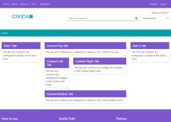
|
images/MAINT_CONTAINER_PARAMS_OPAC_SIDE_ZONES_ONLY_thumb.png 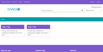
|
images/MAINT_CONTAINER_PARAMS_OPAC_NO_SIDE1_thumb.png 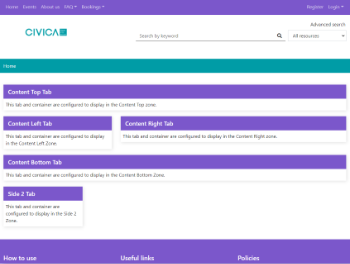
|
|
|
In this capture:
|
Tabs
To create a new Tab;
- Navigate to Maintenance > OPAC & Enquiry > Container Parameters.
- Select the appropriate View (usually WPAC_WP for Spydus 10.2-10.9, or OPAC_WP for Spydus 11 or higher).
- Select the appropriate Format.
- Click the New Tab button in the action bar.
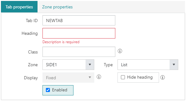
Tab ID
The Tab ID identifies the Tab, and is the property that links Containers to Tabs.
Heading
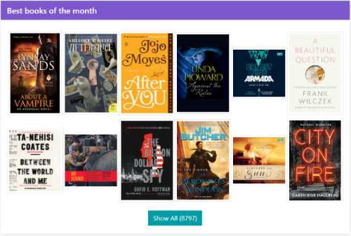
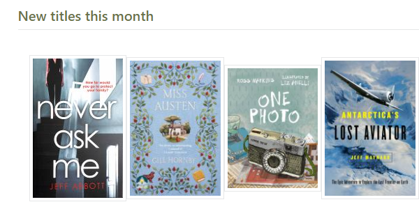
The text in the Heading field will display in the header row of the Tab/Container. e.g. in the screenshot below, the Heading is 'Best books of the month'.
Class
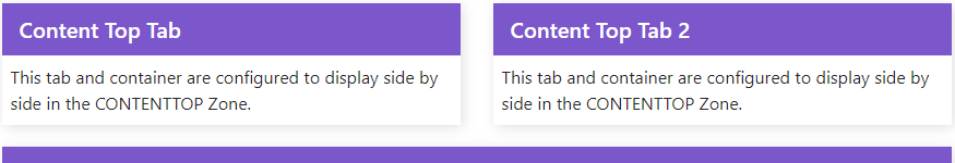
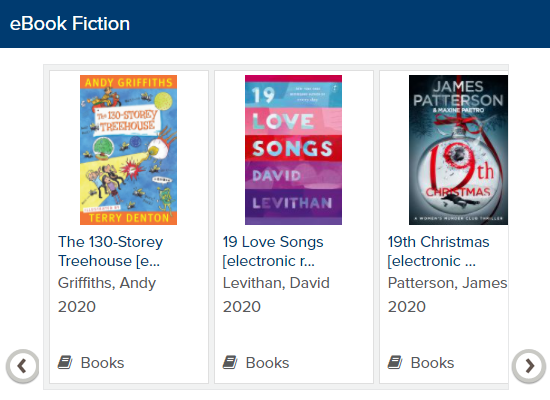
The Class definition is an optional value that allows users to set the column with of a Tab within a Zone. While the Class definition for a Zone specifies how much of the 12 column page width a Zone occupies, the Zone itself is then divided into 12 Zones. e.g. in the screenshot below, both Tabs are in the CONTENTTOP Zone, and each Tab's Class is defined as col-6.
Zone
Per the diagram above, the Zone that a Tab belongs to denotes its approximate location and size in the page. Changes can be made to the Zone Class properties to modify their appearance. See the section on Zones above for more information.
Display
The Display property specifies whether the Tab is Fixed, Collapsable (open), or Collapsable (closed).
- Fixed - A Fixed Tab will always be open, and cannot be collapsed. Fixed is the only option for List type Tabs.
- Collapsable (open) - A Collapsable (open) Tab will by default be expanded, but clicking on the Heading will collapse the Tab, hiding the content and showing only the Heading text.
- Collapsable (closed) - A Collapsable (closed) Tab will by default be collapsed, but clicking on the Heading will expand the Tab, showing the content.
Type
The Tab Type property denotes what content is in the Container, and potentially how it is displayed. The available options are:
- UL - Unordered list
- IN - Information – taken from html snippet (containers starting with X)
- GV - Grid View (requires Spydus 10.1.6 or later)
- GD - Gallery display
- BC - Browse cloud
- BL - Browse list
- RT - Rich Text (requires Spydus 10.1.6 or later)
See below for an example of each Tab type:
 |
 |
 |
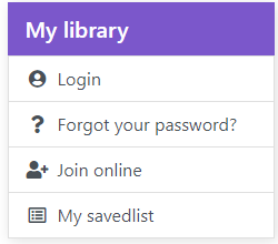
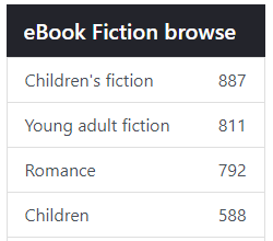
| Unordered List | Browse List | Information |
 |
| Grid View |
 |
| Gallery Display |
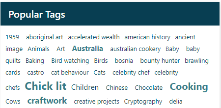 |
| Browse Cloud |
Hide Heading
If the Display property is set to Fixed, the Heading row can be hidden by checking this option. With Collapsable Tabs, the Heading cannot be hidden, as clicking the Heading is required to expand or collapse the Tab.
Enabled
Tick the Enabled option to display a Tab and its Containers in the OPAC.
Adding Containers to Tabs
See the article on Container properties for information on building Containers.